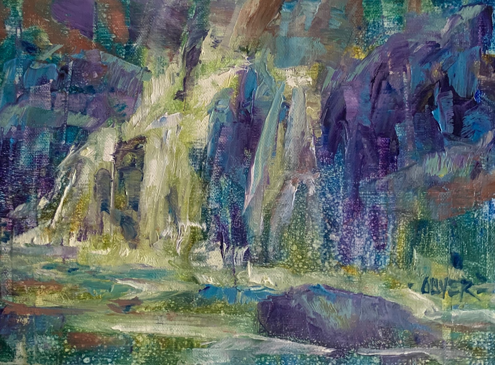
Rushing Water
6"x8" oil on panel $150
Purchase SOLD
Artist Note
When the guild classes were stopped
in March due to c-virus,
I still owed the painters a lesson
so I gave some thought to what
would be the most useful and guess what...
Absolutely...
Hands down...
THE Number one problem...
is watching artists
trying to paint from a photo
EXACTLY what they see
without doing a few
The typical problems are
VALUE
&
COMPOSITION
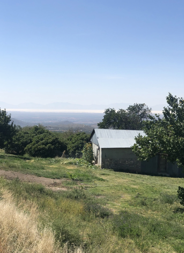
This is the original photo which I used for the painting.
As an Impressionist I had to add
the colors I clearly remember seeing
Water is full of colors
in the sunshine and
also reflects the sky.
The dark values appear way too dark
as we know shadows are transparent...
but notice how the tops of the rocks
are not only competing with the value of the water
but tend to lead the eye out of the pic.
Below is how I check if the composition works.
I like to use
"every quarter should be different"
a very useful way to prevent matchy-matchy areas.
At the same time I mark off the center to help me
remember to have a circle of the interest
right in the middle.
When I first became aware of art workshops
in the 90's, I went to a
few of the really good painters.
Ovanis Berbarian, for florals.
Dan Gerhart for figure.
Michael Lynch for landscapes.
plus
Richard Schmid, Burt Silverman - demos at ASL
They ALL said "paint what you SEE."
Trouble is... I didn't SEE what they did.
I had to learn.
But, hey, they too had to learn to "see."
I went back and found their early work
and it was heartwarming to find
when they first started they made
the same mistakes as all of us.
Time and learning are what make the difference.
Remember, shadows are transparent.
If you are painting plein air
you can see into the shadows very clearly
but a photo can make them way too dark.
Look above at original photo.
I took this in Yellowstone
and I could see into those dark areas
and clearly "see' everything,
all the bushes, stones and trees
surrounding this gushing stream.
You cannot make any of those
out in the photo
Sunsets are the worst offenders.
The ground is never as dark at sunset
as the photo makes them.
I now take two pics - one of the sun setting
and one of the ground.
But logically, when you look how
light the sky still is overhead, you know
it cannot be really dark on the ground.
The sky can look waaaay too dark
in a poor photo. Usually it produces a
strong cyan blue - especially at the top,
whereas it is actually
more of a cobalt or ultramarine.
Take the photo to a window
and look halfway up in the sky
to compare,
and then down at the pic.
You will see it.
The blue sky overhead is not what
you paint.
Shadows are not the same gray
over everything they travel.
A LIGHT COLOR IN SHADOW
BECOMES MORE OF A MIDDLE VALUE
A middle color value goes
deeper in shadow BUT not as dark as
A DARK COLORS IN SHADOW
The reverse is true in the light.
BLACK MOVES TO A MIDDLE VALUE
IN THE LIGHT and even lighter in some cases.
Remember the ABSENCE of light is the darkest
area. Underneath bushes, rocks or in still life
it is the line you see under the object.
Strong sun bleaches out color.
If you cannot paint plein air
then the next best way is to paint from
a monitor of some kind.
Even then you sometimes have to lighten
the darks to see into them.
But if you have a stash of old pics
(like I do)
which inspire you to paint them
then I hope these hints help.
If you are a decorative or abstract painter
none of the above applies.
In my next post I will demo a abstract version.
Cheers everyone. Thank you for staying until the end.
Stay safe.